In 2008, Digg was one of the most popular websites on the internet, attracting 236 million unique visitors annually and being valued at $160 million.
By 2010, as social media became more prominent, Digg decided to steer away from the social bookmarking format that made them successful. They released a radical change to the site’s design that acted and looked more like Facebook and other social media platforms.
The redesign was unanimously derided by their users, leading to a quick, steep decline for the company. By 2012, Digg was a shadow of its former self and was sold off for just $500,000.
The lesson from Digg’s blunder is that design can make or break a website, sometimes both.
A study from Stanford found that 75% of customers base credibility judgments on web design, a number that proves just how important design can be. And these judgements come quick, with Google finding that the average user makes a decision about a website in 50 milliseconds.
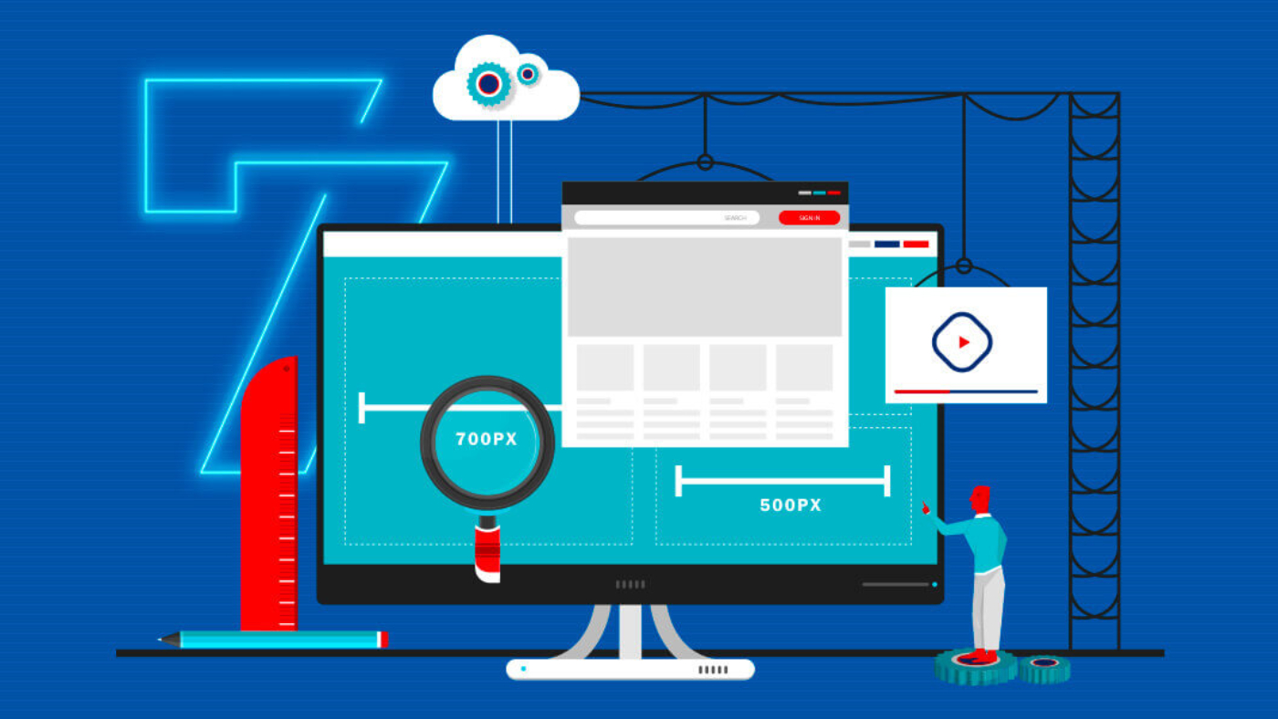
While there’s no silver bullet for good web design, years of trial of error have shown that certain design elements work better than others.
Here are 7 of best design practices to keep your site modern, engaging, and irresistible to visitors.
Keep It You
Another lesson from the Digg fiasco is that it’s never a good idea to follow trends just for the sake of doing it. A website’s design should reflect the unique qualities of the business, as this serves as its first introduction to the world.
What are the primary qualities you want to express through your site? A brand archetype activity can often be a helpful exercise for spurring thoughts about your organization’s personality.
Your brand identity should inform the eventual design elements, including fonts, use of colors, images, and videos. You may even want to compile a brand guide to keep these elements in one place and to provide reference for your design team.
These elements should be kept consistent from page to page in order to articulate the personality of your business. There’s a reason why brands like Coca Cola and Starbucks are so protective over their brand assets: They’re valuable.
Keep It Simple
With users already suffering from information overload, the last thing they want is a confusing website loaded with images, popup ads, auto-play videos, and walls of text.
Despite this fact, a GoodFirms study found that the most common web design mistake made by small and medium-sized businesses was having an “overcrowded” website.
Compare this with Apple’s website and the amount of white space used. The simplistic, minimalist design has a calming effect and directs focus on the company’s sleek products.
Designing a site for simplicity allows the user to feel at ease and allows the site owner to highlight important information. Users will often overlook elements of a site if the content is confusing. Simplifying a site’s design makes it easier for users to find what they’re looking for.
You’ll also want to consider how to simplify the hierarchy of the site, or the order of page content. If an entire website is a map, you need to provide the simplest route for users to accomplish their goal.
One of the best ways to organize your site hierarchy is by creating a site map. Along with organization, site maps allow your site to be more easily found by Google’s web crawlers.
Keep It Fast
Page speed is sometimes left out of the design conversation. Yet nearly every design decision will have an impact on a website’s speed, for better or worse.
Research published by Loadstorm found that a one-second delay reduced page views by 11% and conversions by 7%. On the other hand, Deloitte found that just a 0.1 second boost in page speed led to more than an 8% increase in both conversions and page views.
A site overly packed with unoptimized images and video adds to the weight of a site. The heavier the site, the slower it loads. Keeping a page light and simple is the first defense against bloat and slow load speeds.
In addition to keeping your design simple, there are a few steps to take in order to speed up your site. They include:
- Optimizing images and video
- Minifying HTML and CSS
- Compressing HTML and CSS
- Browser caching
- Reducing redirects
Plugins like WP Rocket help you easily implement these speed fixes, while W3 Total Cache helps compress HTML and CSS files with Gzip, along with browser caching. Check out this article to learn even more methods to boost your page speeds.
Keep It Visual
Images and video have been proven to attract attention and keep visitors on the page, making it a necessary part of any modern website.
Shopify found that high-definition product videos can increase conversions by 80%, while eBay Research Labs found that featuring product images “help increase buyer’s attention, trust and conversion rates.”
However, all images and videos should be optimized to keep your page weight as light as possible, as they typically account for two-thirds of an average web page’s total size.
A few guidelines for presenting images include:
- Keeping large or full-screen background images below 1MB
- Keeping small web graphics below 300KB
- Choosing “Save for web” when saving an image to give it a web-friendly resolution
- Reducing image dimensions is ok, but never enlarge them
- Some mobile devices have very high resolution displays that will highlight defects
In general, JPEG files take up less space than PNG files, especially for photos. Meanwhile, PNGs are generally used for logos and other images with simple colors. WebP is a more recent image format that achieves an average of 30% more compression than JPEG, without loss of image quality.
There are also a number of simple tools used to compress images, such as Imagify and ShortPixel that integrate seamlessly with WordPress sites. Check out Shopify’s 10 Must Know Image Optimization Tips to find additional tools that can easily be applied to any website.
Keep It Short
Content is received differently on the internet than in print, where users tend to scan content rather than fully read it. Jakob Nielsen found that users read only about 28% of the words during an average website visit, while other studies find that percentage even lower.
Due to the changes in behavior, websites will need to modify their content to fit the habits of modern internet users. Some general recommendations include:
- Limiting paragraphs to 80 words.
- Writing at an 8th-grade level (You can use the Hemingway Editor to assess your site’s reading level).
- Leaving white space between paragraphs.
- Using headings and subheadings as much as possible.
- Using bulleted lists instead of text blocks when appropriate.
- Keeping a consistent color and font.
As evidenced above, using bullet points allows you to quickly relay information and vary the content. Changing up the types of content being delivered keeps the reader engaged and less likely to bounce.
Keep It Responsive
Responsive websites are able to adapt to mobile devices without any work on the user’s end. Sites not responsive to mobile force the user to pinch the image in order to get the right size, a frustrating experience for anyone who’s been there.
With over 58% of all retail web traffic coming from mobile devices, websites not optimized for mobile are at a huge disadvantage. A study by Northern Arizona University found that 85% of adults think that a company’s mobile website should be as good or better than their desktop site.
Sometimes, optimizing for mobile can be as simple as defining a compatible viewport for mobile devices. Site owners can easily enable a mobile viewport by pasting the following HTML into the site’s header:
<meta name=viewport content=”width=device-width, initial-scale=1>
Be aware that this setting must be applied to every webpage, and each webpage could react differently to the setting, depending on the layout. Test, test, test!
Try every webpage on your mobile device to make sure the result is what you want. Also, many WordPress themes automatically include a mobile viewport option along with a full “responsive” design, so look into this option first if the site is run with WordPress.
Google also offers a Mobile-Friendly Test that analyzes sites for mobile accessibility. Simply enter the site’s URL and click “Test URL.” Google supplies a list of improvements in order to create a better user experience and get more in line with Google’s accessibility guidelines.
Keep It Accessible
Web accessibility has become a much-discussed issue in recent years with the introduction of legislation such as Europe’s General Data Protection Regulation (GDPR) and the California Consumer Privacy Act (CCPA)
Accessibility simply means allowing the maximum number of users to access your site. In a country where 61 million suffer from some type of disability, ignoring accessibility practices means cutting off nearly 1 out of every 5 users.
Accessibility involves multiple sensory channels, such as sight and sound, in addition to physical impairments. Web-specific accessibility standards are set by the Web Content Accessibility Guidelines (WCAG 2.1), published by the World Wide Web Consortium (W3C), the primary organization for setting internet-based standards.
W3C’s website provides an in-depth explanation of the various elements of accessibility and steps for making your site more accessible. They include the following best practices:
- Providing screen reader support
- Enabling keyboard access
- Providing clear titles for pages and documents
- Providing alt-text
- Providing transcripts for video/audio
- Enabling Accessible Rich Internet Applications (ARIA)
- Creating tabbable forms
- Removing obtrusive JavaScript
Check out this article to go more in-depth with each issue and find out how to easily implement best accessibility practices.
If you want to get a high-level understanding of accessibility, start by getting your trust score from DigitalTrust.
To test accessibility, there many tools available online including:
- Google Accessibility Insights for Web
- WebAIM’s WAVE tool
- Deque’s axe accessibility tool
- WebAIM’s Color Contrast tool
Additionally, tools like WebFX Readability Test Tool and Readable score your site’s text based on a number of metrics, such as the Flesch Kincaid Reading Ease score, the Gunning Fog Score, and the SMOG Index.
Keep It Trustworthy
Since design is the first thing a user notices upon visiting a site, it’s one step that can’t be slapdash. Users tend to trust sites that run smoothly and get them to where they want to go, all issues that take thought and strategy to accomplish.
Every business relationship begins with the bedrock of trust. But if the relationship starts on rocky ground, then it’s difficult to gain back that trust.
With the suggestions described above, you’ll be on your way to earning user trust and, eventually, more sales.
To go even deeper, consider getting your Trust Score from DigitalTrust. This scans your site for over 50 trust factors including usability, safety, transparency, and reputation, and provides you with an action plan that will help develop the kind of design that leads to more trust.